Growth created inconsistency.
As the product grew, teams needed a common visual and interaction language. Repeated patterns were being solved independently, which made experiences feel inconsistent and created unnecessary design and development work.
The challenge was not simply to create a library of components. It was to create a foundation teams could actually use and extend.
Start with foundations, then build upward.
I established reusable foundations for color, typography, spacing, borders, states, and interaction patterns before expanding into components.
This created a common set of design decisions that could be translated into reusable front-end patterns instead of being recreated from scratch for every feature.
The visual language behind Gravity.
The system's foundations created consistency before a component was ever placed on a page.
Color
A focused palette establishes hierarchy while semantic colors communicate status alongside text and icons.
Typography
A clear type hierarchy separates page titles, section headings, body content, labels, and supporting information.
Spacing
A predictable scale makes layouts easier to compose and helps reduce one-off implementation decisions.
States
Interaction states are treated as part of the component rather than visual polish added at the end.
Reusable components became the building blocks.
Each component was designed to be recognizable, reusable, responsive, and understandable to both designers and developers.
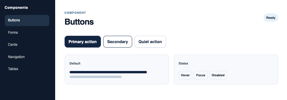
Buttons
Clear hierarchy and predictable states for common actions.
Forms
Consistent labels, controls, validation, and focus behavior.
Cards
Structured content containers with consistent hierarchy and spacing.
Navigation
Predictable navigation patterns make location and hierarchy clear.
Data displays
Tables and information-dense layouts use hierarchy to reduce cognitive load.
Feedback
Status, confirmation, loading, and error patterns communicate what happened next.
Components work together to support real tasks.
Complex forms
Break complicated workflows into smaller steps while maintaining context and clear progress.
Benefits comparison
Use consistent cards, tables, controls, and hierarchy to help users compare options.
Responsive behavior
Patterns adapt across screen sizes without making hover the only way to understand an interaction.
Accessible feedback
Use text, structure, focus, and appropriate status messaging instead of relying on color or animation alone.
A system needs shared ownership.
Gravity was intended to connect design and engineering, not create another silo. Documentation helped communicate component intent, usage, states, and implementation expectations.
The most valuable outcome was a shared vocabulary. Designers could talk about patterns using consistent terminology, while developers had clearer expectations for reusable implementation.
Primary button
Gravity created a stronger foundation for consistent SaaS experiences.
The system gave design and engineering teams a shared vocabulary for building the product, reduced repeated design decisions, and established reusable patterns that could scale with the product.
A design system is a living product.
The strongest systems evolve with the products and people they support. The goal is not to create a perfect library once. It is to create a foundation that makes thoughtful, accessible decisions easier to repeat as the product changes.